UA Baggage
Timeline
2022 - 2023
My Role
Senior UX Designer
What is Baggage Payment?
United Airlines’ current bag check-in process is very minimal and lacking functionality. In the current bag check-in process, only standard bags are allowed.
However, there are different bags, overweight, oversized, and many specialty items that need to be accounted for. Our goal was to allow customers to check-in any types of bags and/or specialty items through their phones.
Why?
As COVID started slowing time, people started traveling more. As a result, airports began crowding immensely and lines were getting long. Being able to check-in bags within the mobile app, without having to be in the airport physically, will greatly reduce the amount of lines formed for the bag check-in section.
In addition, we want to address the amount of uncertainties that customers have when bringing non-standard bags and specialty items.
My Role
My role was the lead designer for the end-to-end flow for Checked Bags. I worked closely with other MBTs to ensure changes won’t affect their missions. I also collaborated with Business Analysts and Project Owners to drive workshops and requirements.
Current Flow
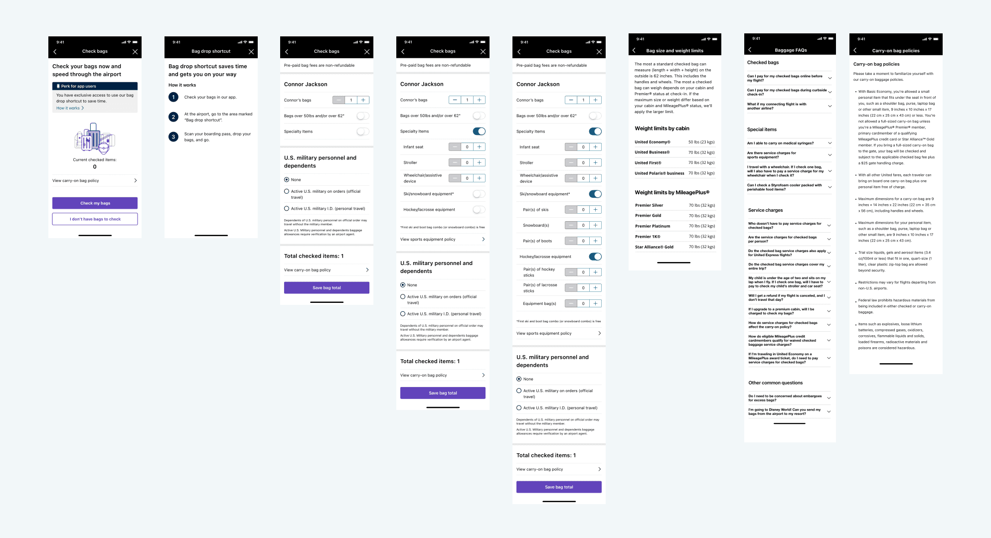
In our current flow, the process is extremely convoluted and has no visual elements to help assist customers. In addition to all this text, there are items that are not explained - which leaves the customers more confused.
Competitive Analysis
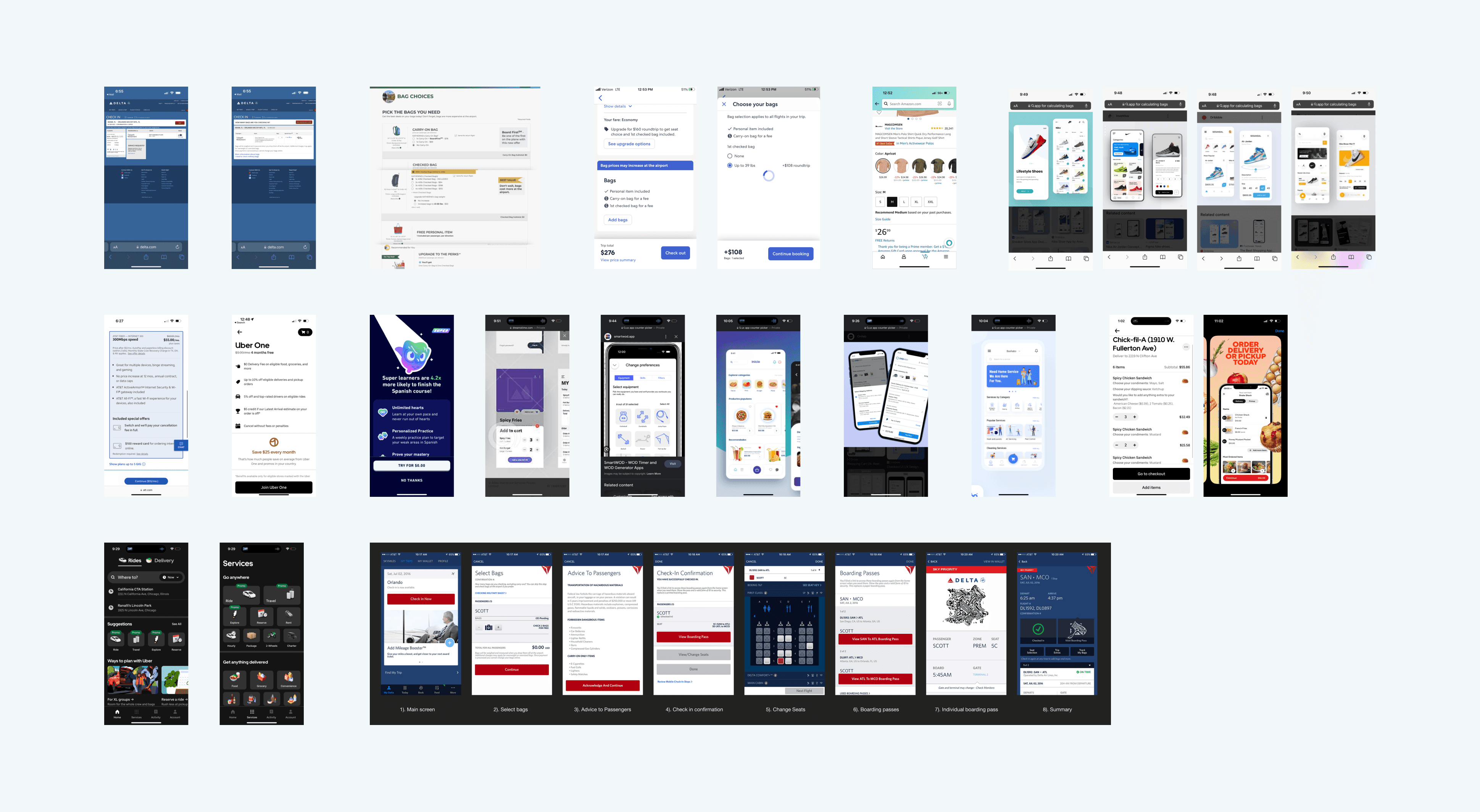
Before getting started with the workshop, I analyzed direct and indirect competitors on how they showed special options in addition to standard options.
Workshop
We held a workshop with multiple sessions and laid out our goals, ideas, recommendations, and current data to gather sufficient information for an initial design.
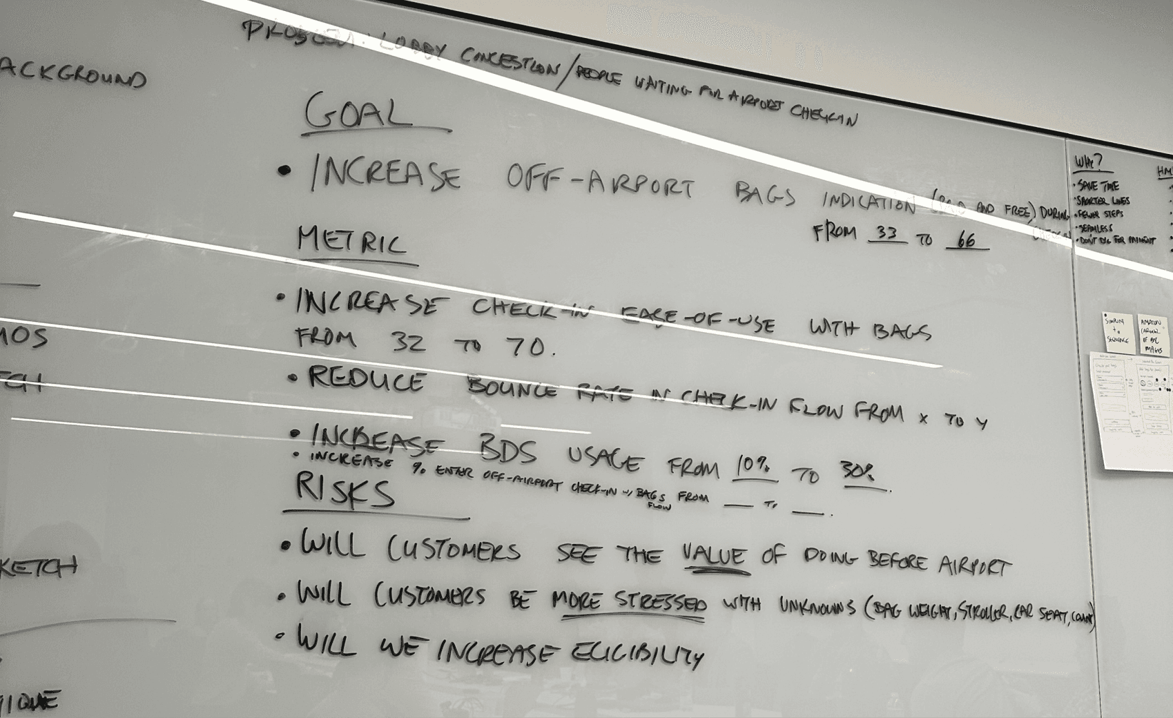
Goal: Increase off-airport bag check-ins
Increase check-in ease of use
Reduce bounce rate in check-in flow
Increase BDS usage from 10% to 30%
Will customers see the value of doing this before the airport?
Will customers be more stressed with unknowns (bag weight, special items, etc)?
Will we have to increase eligibility criteria?

Key Recommendations
Highlight standard bags - 85% of bags that were checked were standard bags.
Review language for “special items” - a main pain point discussed was customers didn’t know what specialty items included.
Reduce abandonment rate of purchasing bags - 38% of customers abandon the checkout page for bags. From research, it is strongly driven by the fact that you cannot see the total price until the end of the flow.
Reduce friction/number of screens - simply, a customer wants to check their bag to their destination. We want to streamline and simplify the flow to help customers accomplish their goal.
Gathering ideas
Everyone was assigned to do the Crazy 8’s - an exercise that challenges people to sketch 8 different ideas in 8 minutes. This allows us to think of possible ideas without getting too trapped in the details.


Results of Crazy 8's
After this exercise, we noticed a trend in certain designs that resonated with most people at the workshop.
Simplicity: being able to view things at first glance and realize the functionality
Focal numbers: having the primary function of adding bags be the main focus
Descriptions: visual images and descriptive text to clear confusion
End of Workshop
Through the workshop, we were able to realize the key recommendations and design direction. With these high level requirements and ideas as references, I began to create my first iteration.
Initial Iterations
With the workshop results in mind, I designed some initial explorations to visualize the information. This would encompass all the pain points, key recommendations and Crazy 8 results.
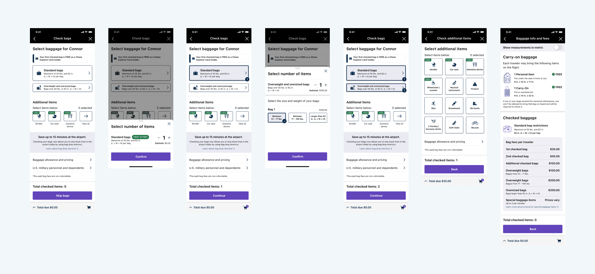
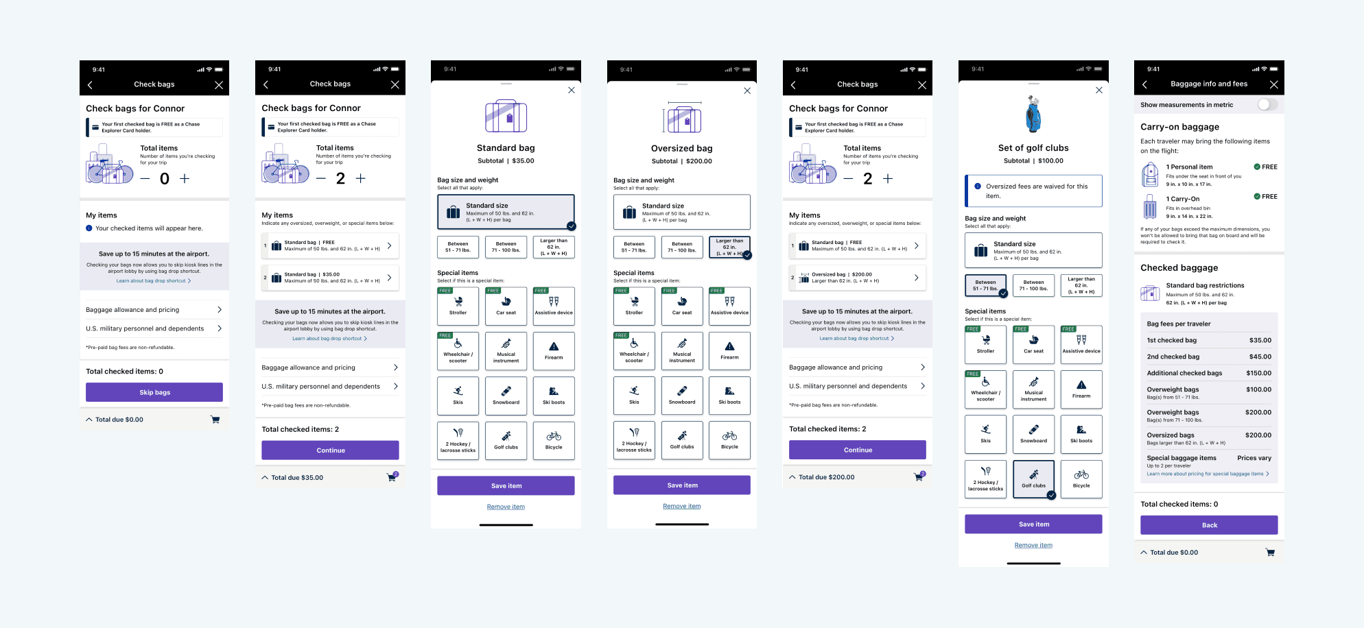
Based off data and recommendations, 85% of checked bags are standard bags. With that in mind, the main focus was having a visual counter defaulted to standard bags. Customers can easily add the number of bags they are checking in without having to look for it.
Testing the Iterations
We decided to test the 2 iterations to get better customer feedback in hopes of narrowing down the design and experience. We laid out some testing metrics to record the data:
Success rate
Time on task
Number of clicks
Flow preference / satisfaction score
Testing Results
After conducting some tests, we were able to collect enough data and feedback to narrow down the design and experience. What we noticed between the 2 iterations was that there were different aspects of each of them that users wanted together.
Post-user testing
With those test results in mind, I created a variant where we meshed the two iterations together - bringing the best of both worlds into one direction.

Multiple user testing + iterations
As we received more feedback from both customers and stakeholders, I adjusted the designs to reflect the common findings. This led to multiple updated iterations and we tested each one to ensure we were going in the direction the customers found easy.
Sometimes companies forget - what makes sense for us, may not be so easy for the customers.
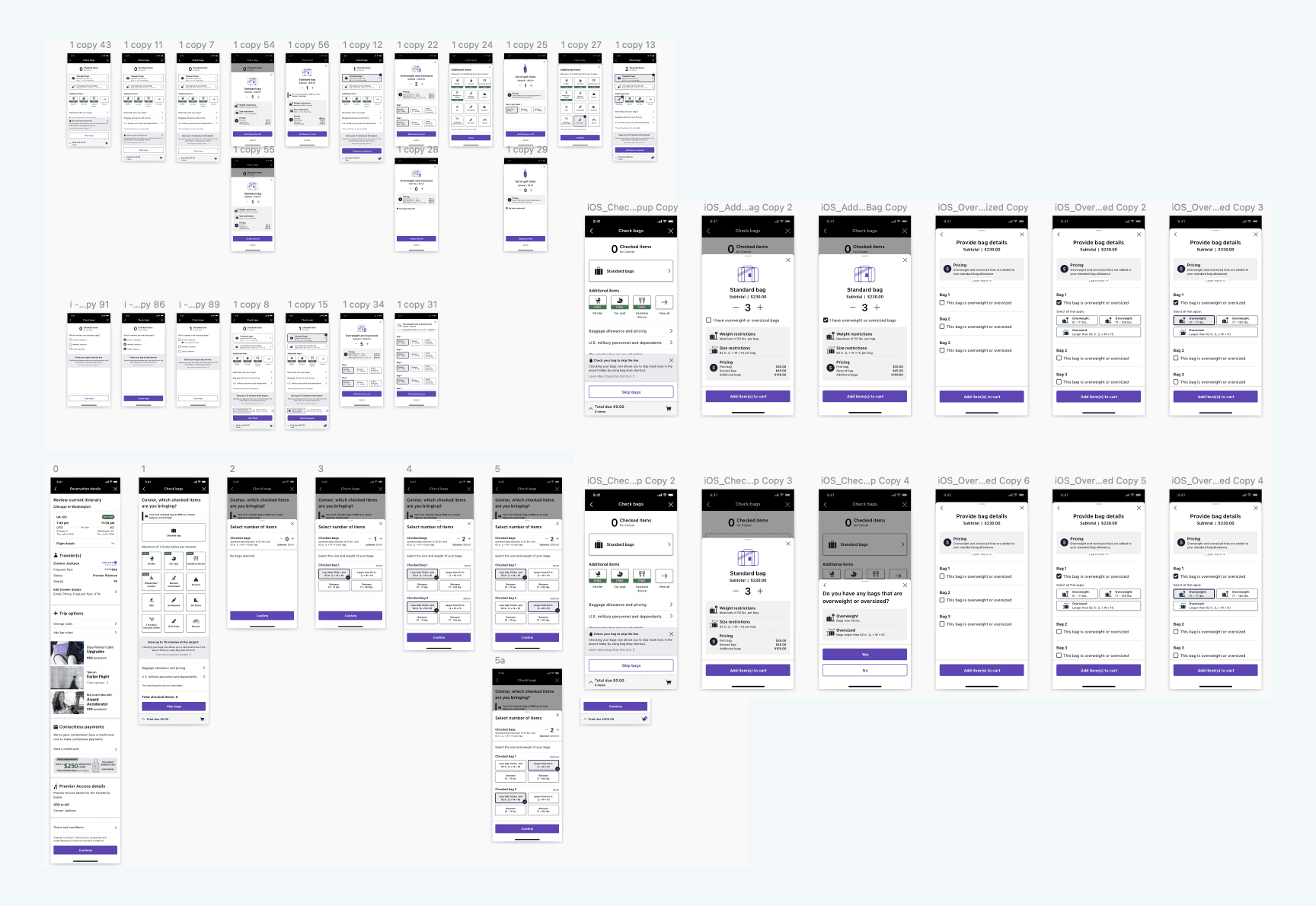
After many iterations and tests…
Through the multiple tests we’ve conducted, we were able to find a design that fit the criteria of the feedbacks we received from users.
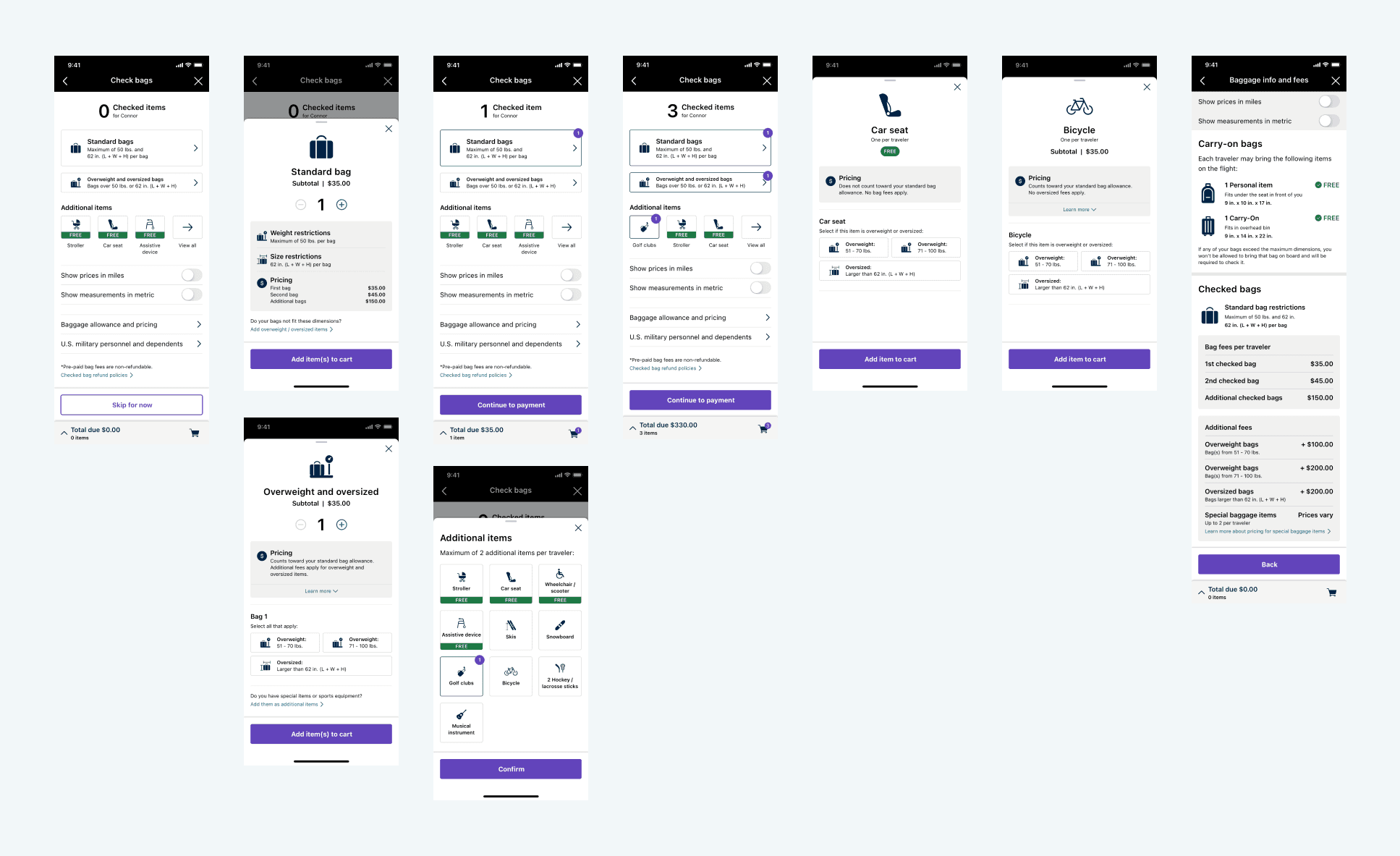
This final design checked-off all the metrics that we based the tests on and brought out the best numbers as well.
Success rates were over 94% for every scenario
The time on task were multitudes faster than the original design
Number of clicks were reduced by around 35%
User flow preference and satisfaction score averaged 9.55 / 10
Conclusion
As digital features get more used, it is crucial to provide a simple experience that anyone at any age can use easily. We want to be inclusive to everyone, especially for features that will help relieve a huge stress when going to airports. Transparency is needed to avoid confusion; confusion causes people to abandon features that are useful for them.
With the new check-in bag flow, fliers can avoid the long lines at the airport and spend their time relaxing until their flight.
UA Baggage
Timeline
2022 - 2023
My Role
Senior UX Designer

What is Baggage Payment?
United Airlines’ current bag check-in process is very minimal and lacking functionality. In the current bag check-in process, only standard bags are allowed.
However, there are different bags, overweight, oversized, and many specialty items that need to be accounted for. Our goal was to allow customers to check-in any types of bags and/or specialty items through their phones.
Why?
As COVID started slowing time, people started traveling more. As a result, airports began crowding immensely and lines were getting long. Being able to check-in bags within the mobile app, without having to be in the airport physically, will greatly reduce the amount of lines formed for the bag check-in section.
In addition, we want to address the amount of uncertainties that customers have when bringing non-standard bags and specialty items.
My Role
My role was the lead designer for the end-to-end flow for Checked Bags. I worked closely with other MBTs to ensure changes won’t affect their missions. I also collaborated with Business Analysts and Project Owners to drive workshops and requirements.
Current Flow
In our current flow, the process is extremely convoluted and has no visual elements to help assist customers. In addition to all this text, there are items that are not explained - which leaves the customers more confused.

Competitive Analysis
Before getting started with the workshop, I analyzed direct and indirect competitors on how they showed special options in addition to standard options.

Workshop
We held a workshop with multiple sessions and laid out our goals, ideas, recommendations, and current data to gather sufficient information for an initial design.

Goal: Increase off-airport bag check-ins
Increase check-in ease of use
Reduce bounce rate in check-in flow
Increase BDS usage from 10% to 30%
Will customers see the value of doing this before the airport?
Will customers be more stressed with unknowns (bag weight, special items, etc)?
Will we have to increase eligibility criteria?

Key Recommendations
Highlight standard bags - 85% of bags that were checked were standard bags.
Review language for “special items” - a main pain point discussed was customers didn’t know what specialty items included.
Reduce abandonment rate of purchasing bags - 38% of customers abandon the checkout page for bags. From research, it is strongly driven by the fact that you cannot see the total price until the end of the flow.
Reduce friction/number of screens - simply, a customer wants to check their bag to their destination. We want to streamline and simplify the flow to help customers accomplish their goal.
Gathering ideas
Everyone was assigned to do the Crazy 8’s - an exercise that challenges people to sketch 8 different ideas in 8 minutes. This allows us to think of possible ideas without getting too trapped in the details.


Results of Crazy 8's
After this exercise, we noticed a trend in certain designs that resonated with most people at the workshop.
Simplicity: being able to view things at first glance and realize the functionality
Focal numbers: having the primary function of adding bags be the main focus
Descriptions: visual images and descriptive text to clear confusion
End of Workshop
Through the workshop, we were able to realize the key recommendations and design direction. With these high level requirements and ideas as references, I began to create my first iteration.
Initial Iterations
With the workshop results in mind, I designed some initial explorations to visualize the information. This would encompass all the pain points, key recommendations and Crazy 8 results.


Based off data and recommendations, 85% of checked bags are standard bags. With that in mind, the main focus was having a visual counter defaulted to standard bags. Customers can easily add the number of bags they are checking in without having to look for it.
Testing the Iterations
We decided to test the 2 iterations to get better customer feedback in hopes of narrowing down the design and experience. We laid out some testing metrics to record the data:
Success rate
Time on task
Number of clicks
Flow preference / satisfaction score
Testing Results
After conducting some tests, we were able to collect enough data and feedback to narrow down the design and experience. What we noticed between the 2 iterations was that there were different aspects of each of them that users wanted together.
Post-user testing
With those test results in mind, I created a variant where we meshed the two iterations together - bringing the best of both worlds into one direction.

Multiple user testing + iterations
As we received more feedback from both customers and stakeholders, I adjusted the designs to reflect the common findings. This led to multiple updated iterations and we tested each one to ensure we were going in the direction the customers found easy.
Sometimes companies forget - what makes sense for us, may not be so easy for the customers.

After many iterations and tests…
Through the multiple tests we’ve conducted, we were able to find a design that fit the criteria of the feedbacks we received from users.

This final design checked-off all the metrics that we based the tests on and brought out the best numbers as well.
Success rates were over 94% for every scenario
The time on task were multitudes faster than the original design
Number of clicks were reduced by around 35%
User flow preference and satisfaction score averaged 9.55 / 10
Conclusion
As digital features get more used, it is crucial to provide a simple experience that anyone at any age can use easily. We want to be inclusive to everyone, especially for features that will help relieve a huge stress when going to airports. Transparency is needed to avoid confusion; confusion causes people to abandon features that are useful for them.
With the new check-in bag flow, fliers can avoid the long lines at the airport and spend their time relaxing until their flight.
UA Baggage
Timeline
2022 - 2023
My Role
Senior UX Designer

What is Baggage Payment?
United Airlines’ current bag check-in process is very minimal and lacking functionality. In the current bag check-in process, only standard bags are allowed.
However, there are different bags, overweight, oversized, and many specialty items that need to be accounted for. Our goal was to allow customers to check-in any types of bags and/or specialty items through their phones.
Why?
As COVID started slowing time, people started traveling more. As a result, airports began crowding immensely and lines were getting long. Being able to check-in bags within the mobile app, without having to be in the airport physically, will greatly reduce the amount of lines formed for the bag check-in section.
In addition, we want to address the amount of uncertainties that customers have when bringing non-standard bags and specialty items.
My Role
My role was the lead designer for the end-to-end flow for Checked Bags. I worked closely with other MBTs to ensure changes won’t affect their missions. I also collaborated with Business Analysts and Project Owners to drive workshops and requirements.
Current Flow
In our current flow, the process is extremely convoluted and has no visual elements to help assist customers. In addition to all this text, there are items that are not explained - which leaves the customers more confused.

Competitive Analysis
Before getting started with the workshop, I analyzed direct and indirect competitors on how they showed special options in addition to standard options.

Workshop
We held a workshop with multiple sessions and laid out our goals, ideas, recommendations, and current data to gather sufficient information for an initial design.

Goal: Increase off-airport bag check-ins
Increase check-in ease of use
Reduce bounce rate in check-in flow
Increase BDS usage from 10% to 30%
Will customers see the value of doing this before the airport?
Will customers be more stressed with unknowns (bag weight, special items, etc)?
Will we have to increase eligibility criteria?

Key Recommendations
Highlight standard bags - 85% of bags that were checked were standard bags.
Review language for “special items” - a main pain point discussed was customers didn’t know what specialty items included.
Reduce abandonment rate of purchasing bags - 38% of customers abandon the checkout page for bags. From research, it is strongly driven by the fact that you cannot see the total price until the end of the flow.
Reduce friction/number of screens - simply, a customer wants to check their bag to their destination. We want to streamline and simplify the flow to help customers accomplish their goal.
Gathering ideas
Everyone was assigned to do the Crazy 8’s - an exercise that challenges people to sketch 8 different ideas in 8 minutes. This allows us to think of possible ideas without getting too trapped in the details.


Results of Crazy 8's
After this exercise, we noticed a trend in certain designs that resonated with most people at the workshop.
Simplicity: being able to view things at first glance and realize the functionality
Focal numbers: having the primary function of adding bags be the main focus
Descriptions: visual images and descriptive text to clear confusion
End of Workshop
Through the workshop, we were able to realize the key recommendations and design direction. With these high level requirements and ideas as references, I began to create my first iteration.
Initial Iterations
With the workshop results in mind, I designed some initial explorations to visualize the information. This would encompass all the pain points, key recommendations and Crazy 8 results.


Based off data and recommendations, 85% of checked bags are standard bags. With that in mind, the main focus was having a visual counter defaulted to standard bags. Customers can easily add the number of bags they are checking in without having to look for it.
Testing the Iterations
We decided to test the 2 iterations to get better customer feedback in hopes of narrowing down the design and experience. We laid out some testing metrics to record the data:
Success rate
Time on task
Number of clicks
Flow preference / satisfaction score
Testing Results
After conducting some tests, we were able to collect enough data and feedback to narrow down the design and experience. What we noticed between the 2 iterations was that there were different aspects of each of them that users wanted together.
Post-user testing
With those test results in mind, I created a variant where we meshed the two iterations together - bringing the best of both worlds into one direction.

Multiple user testing + iterations
As we received more feedback from both customers and stakeholders, I adjusted the designs to reflect the common findings. This led to multiple updated iterations and we tested each one to ensure we were going in the direction the customers found easy.
Sometimes companies forget - what makes sense for us, may not be so easy for the customers.

After many iterations and tests…
Through the multiple tests we’ve conducted, we were able to find a design that fit the criteria of the feedbacks we received from users.

This final design checked-off all the metrics that we based the tests on and brought out the best numbers as well.
Success rates were over 94% for every scenario
The time on task were multitudes faster than the original design
Number of clicks were reduced by around 35%
User flow preference and satisfaction score averaged 9.55 / 10
Conclusion
As digital features get more used, it is crucial to provide a simple experience that anyone at any age can use easily. We want to be inclusive to everyone, especially for features that will help relieve a huge stress when going to airports. Transparency is needed to avoid confusion; confusion causes people to abandon features that are useful for them.
With the new check-in bag flow, fliers can avoid the long lines at the airport and spend their time relaxing until their flight.
