UA Digital Menu
Timeline
2022 - 2023
My Role
Senior UX Designer
What is Digital Menu?
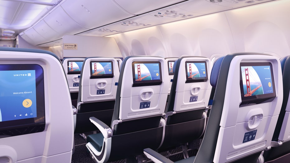
In today’s airline world, currently none of the major airlines provide a way to pre-order items prior to the flight. There are many unsatisfied fliers that do not get the items they want during a flight due to shortages and dietary needs. Our goal was to capitalize on the lack of pre-flight menu experiences whilst making sure every flier gets the meal they desire.
Goals
Fliers with dietary restrictions and allergens felt they had no choice but to hope the flight had items that fit their needs.
Frequent fliers were upset that the flight ran out or didn’t have the expected items mid-flight.
Trip planners were worried because of the lack of transparency and security of what the menu might have.
My Role
I led the design of the end-to-end digital menu experience and collaborated with stakeholders to assist in the creation of the BRD (Business Requirement Document). A content writer also assisted in making sure that the messages were clear and accessible.
Users
The main users are our Tellers at physical TD Bank stores. This includes a variety of different roles such as Store Manager, Individual Customer Assistant, Customer Service Representative, and Front Desk Teller. Making it easily usable to all levels of users was crucial.
Competitive Analysis
I began with an analysis of different menu experiences across both direct and indirect competitors.
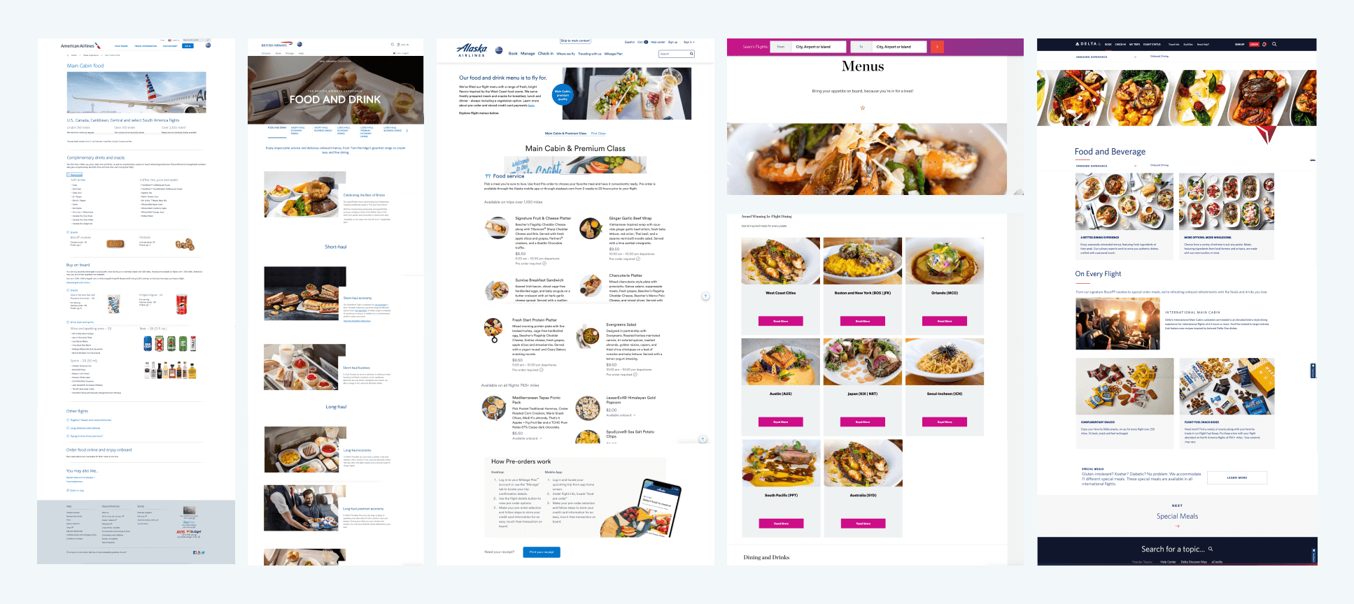
Has a design structure
Enticing images of the dishes
Informational awareness for each dish
Current experience
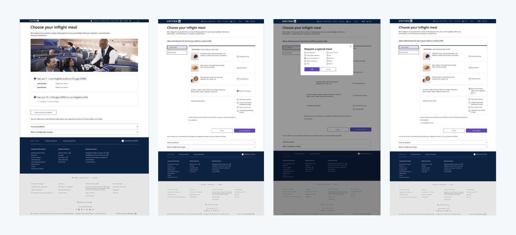
The current United Airlines menu experience is barebone and difficult to navigate. Users have complained about the lack of visual and prominent navigation to the menu. It also didn’t help that the functionality and visibility of the menu changed depending on the departure date.
Digital Menu Workshop
Since the option to pre-order items were not used by our competitors, we had to start from scratch. We held a workshop to figure out what problems fliers were having before and during their flights.
Fliers with dietary restrictions and allergens felt they had no choice but to hope the flight had items that fit their needs.
Frequent fliers were upset that the flight ran out or didn’t have the expected items mid-flight.
Trip planners were worried because of the lack of transparency and security of what the menu might have.
Source of the problem and the solution
When looking through the main issues, there is a noticeable pattern. These issues affect fliers the most when they’re already on the plane - which at that point it’s already too late. There is nothing they can do besides gambling on the chance the flight will have the items they want or need.
With that in mind, it became clear that we had to fix these issues before the actual flights (pre-flight).
Defining the scope
As one of the biggest projects at United Airlines, creating a reasonable present and future scope was crucial.
Initial Scope
Creating a menu for different timelines and cabins
Bringing in special meals for people with dietary needs
Allowing customers to access Digital Menu anytime
Allowing customers to pre-order their meals
Sticking to a mix of the new and old design system
Timelines and Physical menu
Before getting into the design, there were some prerequisites to the digital menu process.
One, there were different timelines for the functionality of the digital menu and pre-orders:
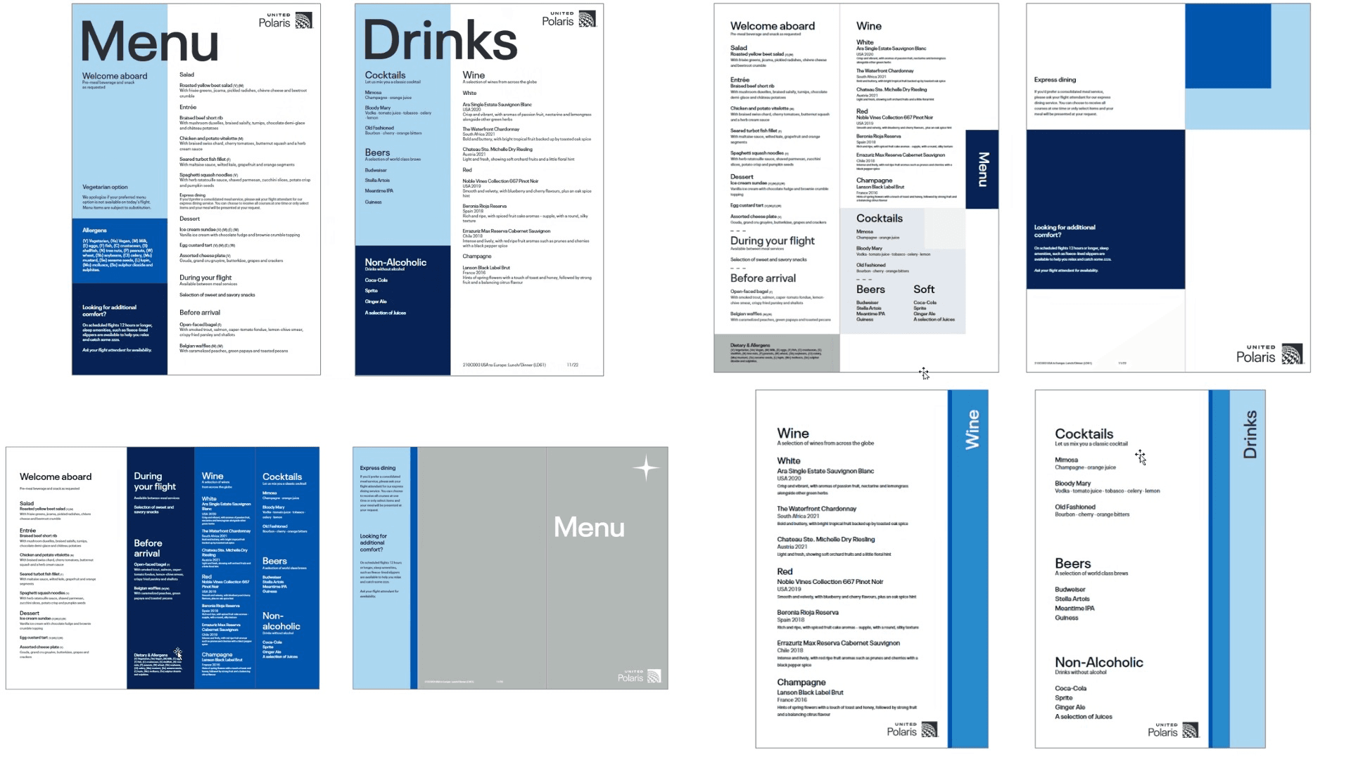
Two, United Airlines has already been working on a new physical menu design; and so the digital menu will need a similar look and feel.
Timelines Explained
300 days - 24 days: Generic Menu
During this timeline, customers can view the Digital Menu. However, items are not yet finalized because the flight is too far into the future. Instead, customers will see a generic menu where we describe what may be on their flight.
24 days - 5 days: Finalized Menu
When customers get to 24 days to 5 days from their flight, the menu items are finalized. Pre-orders are not yet opened but customers can start to plan based on their wants and needs.
5 days - 24 hours: Pre-order
Pre-orders are finally open! Customers can select and reserve the items of their choice - including special dietary items.
<24 hours: Pre-orders closed
Pre-orders are closed, but customers can still view the menu and what they’ve pre-ordered.
Laying out the base
As explained previously, there are 4 different timelines for Digital Menu. One thing that was important in the design and experience was to keep it consistent regardless of the timeline.
If a customer views the menu 100 days from the flight and comes back 95 days later, they shouldn’t have to relearn how to navigate through the menu.
Lofi Mockups
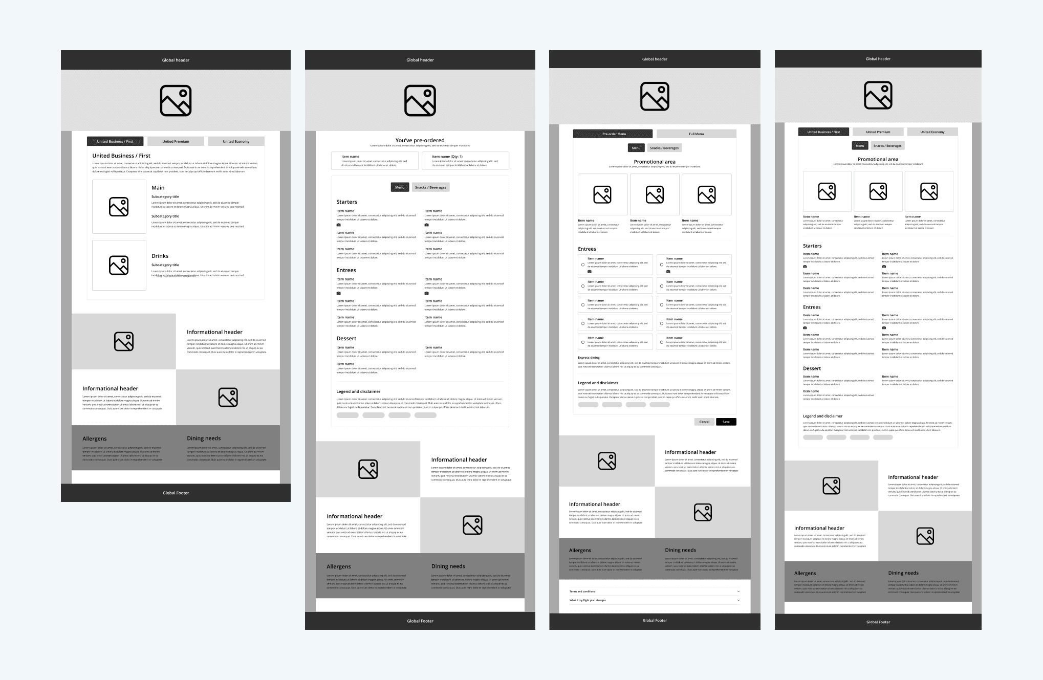
Keeping all that in mind, I created low fidelity mockups to lay out how the menu would look. Each timeline kept a consistent layout whilst including any new features that may come with it.
Physical brought to Digital
United Airlines was already working on a new physical menu. I was asked to align the Digital Menu visual designs with the physical menu. Some things that are noticeable are:
Hierarchy in typography
Variants of the United Airlines blue
Cascading color blocks

Design Final Result
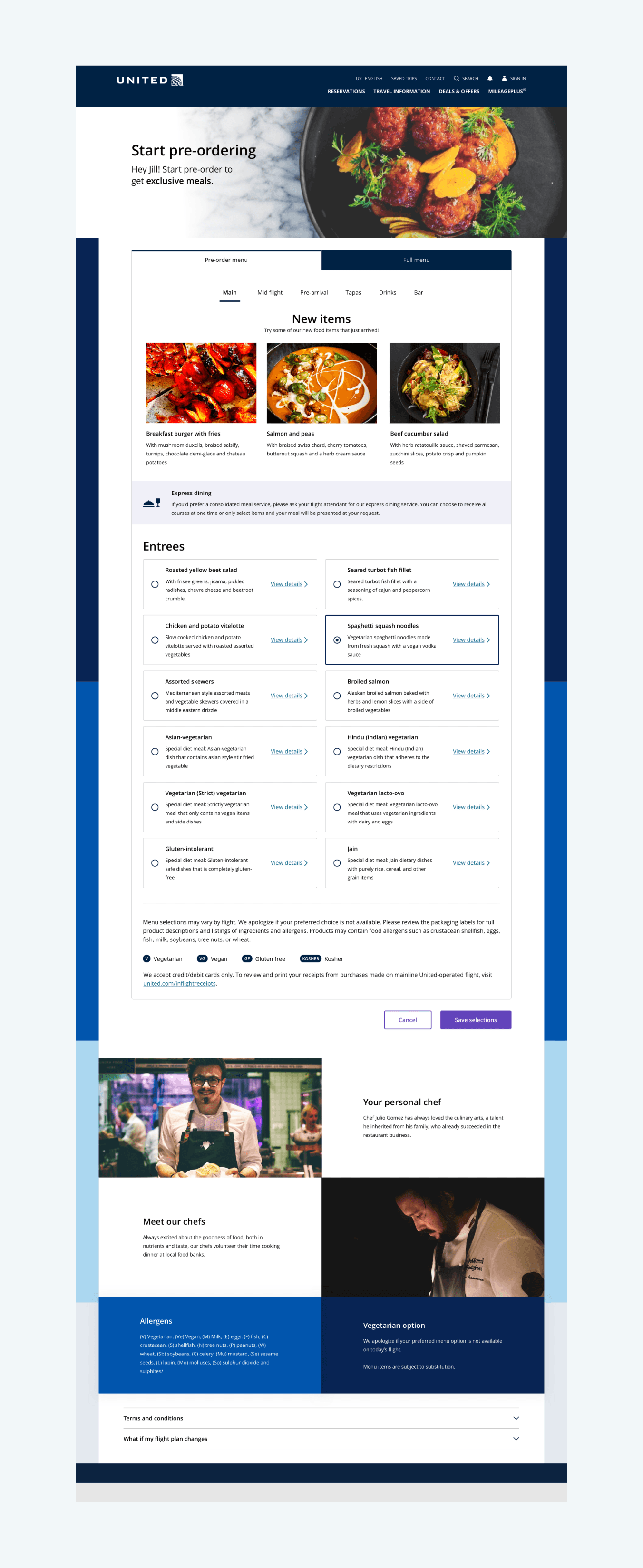
After creating the layout with in-scope functionality and visual alignment with the physical menu, the Digital Menu was brought to life with United Airlines’ branding.

User testing
Prior to the final designs, we had already done some initial testing with the flow and layout. Results were highly positive - especially around the ease of use and being allowed to make decisions based on dietary needs / allergens. This time, user testing was based on multiple criteria:
Customer's cabin
Going through every timeline flow
Secondary functionalities
Using our prototype, we provided tasks for the users to figure out with minimal guidance. At the end of the test, we prompted them to give some feedback based on the ease of use and whether it would be useful for them if this was available.
User testing results
Upon completing our user testing, we had some great results based on the functionalities of our current scope. Users were finding it simple to navigate and use the menu functions to the fullest. They also felt an ease of mind when they realized this meant they wouldn’t have to worry about any uncertainties for their flights.
Conclusion
With the integration of the Digital Menu, customers are able to view their flight’s meals any time before their actual flight. Customers who worried about meal availability, allergens, and special dietary needs, could now rest assured knowing that they will get their food guaranteed.
When you book a flight with United Airlines, you can rest assured knowing we will make sure you get everything that’s included in your fare.
UA Digital Menu
Timeline
2022 - 2023
My Role
Senior UX Designer

What is Digital Menu?
In today’s airline world, currently none of the major airlines provide a way to pre-order items prior to the flight. There are many unsatisfied fliers that do not get the items they want during a flight due to shortages and dietary needs. Our goal was to capitalize on the lack of pre-flight menu experiences whilst making sure every flier gets the meal they desire.
Goals
Fliers with dietary restrictions and allergens felt they had no choice but to hope the flight had items that fit their needs.
Frequent fliers were upset that the flight ran out or didn’t have the expected items mid-flight.
Trip planners were worried because of the lack of transparency and security of what the menu might have.
My Role
I led the design of the end-to-end digital menu experience and collaborated with stakeholders to assist in the creation of the BRD (Business Requirement Document). A content writer also assisted in making sure that the messages were clear and accessible.
Users
The main users are our Tellers at physical TD Bank stores. This includes a variety of different roles such as Store Manager, Individual Customer Assistant, Customer Service Representative, and Front Desk Teller. Making it easily usable to all levels of users was crucial.
Competitive Analysis
I began with an analysis of different menu experiences across both direct and indirect competitors.

Has a design structure
Enticing images of the dishes
Informational awareness for each dish
Current experience
The current United Airlines menu experience is barebone and difficult to navigate. Users have complained about the lack of visual and prominent navigation to the menu. It also didn’t help that the functionality and visibility of the menu changed depending on the departure date.

Digital Menu Workshop
Since the option to pre-order items were not used by our competitors, we had to start from scratch. We held a workshop to figure out what problems fliers were having before and during their flights.
Fliers with dietary restrictions and allergens felt they had no choice but to hope the flight had items that fit their needs.
Frequent fliers were upset that the flight ran out or didn’t have the expected items mid-flight.
Trip planners were worried because of the lack of transparency and security of what the menu might have.
Source of the problem and the solution
When looking through the main issues, there is a noticeable pattern. These issues affect fliers the most when they’re already on the plane - which at that point it’s already too late. There is nothing they can do besides gambling on the chance the flight will have the items they want or need.
With that in mind, it became clear that we had to fix these issues before the actual flights (pre-flight).
Defining the scope
As one of the biggest projects at United Airlines, creating a reasonable present and future scope was crucial.
Initial Scope
Creating a menu for different timelines and cabins
Bringing in special meals for people with dietary needs
Allowing customers to access Digital Menu anytime
Allowing customers to pre-order their meals
Sticking to a mix of the new and old design system
Timelines and Physical menu
Before getting into the design, there were some prerequisites to the digital menu process.
One, there were different timelines for the functionality of the digital menu and pre-orders:
Two, United Airlines has already been working on a new physical menu design; and so the digital menu will need a similar look and feel.

Timelines Explained
300 days - 24 days: Generic Menu
During this timeline, customers can view the Digital Menu. However, items are not yet finalized because the flight is too far into the future. Instead, customers will see a generic menu where we describe what may be on their flight.
24 days - 5 days: Finalized Menu
When customers get to 24 days to 5 days from their flight, the menu items are finalized. Pre-orders are not yet opened but customers can start to plan based on their wants and needs.
5 days - 24 hours: Pre-order
Pre-orders are finally open! Customers can select and reserve the items of their choice - including special dietary items.
<24 hours: Pre-orders closed
Pre-orders are closed, but customers can still view the menu and what they’ve pre-ordered.
Laying out the base
As explained previously, there are 4 different timelines for Digital Menu. One thing that was important in the design and experience was to keep it consistent regardless of the timeline.
If a customer views the menu 100 days from the flight and comes back 95 days later, they shouldn’t have to relearn how to navigate through the menu.
Lofi Mockups
Keeping all that in mind, I created low fidelity mockups to lay out how the menu would look. Each timeline kept a consistent layout whilst including any new features that may come with it.

Physical brought to Digital
United Airlines was already working on a new physical menu. I was asked to align the Digital Menu visual designs with the physical menu. Some things that are noticeable are:
Hierarchy in typography
Variants of the United Airlines blue
Cascading color blocks

Design Final Result
After creating the layout with in-scope functionality and visual alignment with the physical menu, the Digital Menu was brought to life with United Airlines’ branding.


User testing
Prior to the final designs, we had already done some initial testing with the flow and layout. Results were highly positive - especially around the ease of use and being allowed to make decisions based on dietary needs / allergens. This time, user testing was based on multiple criteria:
Customer's cabin
Going through every timeline flow
Secondary functionalities
Using our prototype, we provided tasks for the users to figure out with minimal guidance. At the end of the test, we prompted them to give some feedback based on the ease of use and whether it would be useful for them if this was available.
User testing results
Upon completing our user testing, we had some great results based on the functionalities of our current scope. Users were finding it simple to navigate and use the menu functions to the fullest. They also felt an ease of mind when they realized this meant they wouldn’t have to worry about any uncertainties for their flights.
Conclusion
With the integration of the Digital Menu, customers are able to view their flight’s meals any time before their actual flight. Customers who worried about meal availability, allergens, and special dietary needs, could now rest assured knowing that they will get their food guaranteed.
When you book a flight with United Airlines, you can rest assured knowing we will make sure you get everything that’s included in your fare.
UA Digital Menu
Timeline
2022 - 2023
My Role
Senior UX Designer

What is Digital Menu?
In today’s airline world, currently none of the major airlines provide a way to pre-order items prior to the flight. There are many unsatisfied fliers that do not get the items they want during a flight due to shortages and dietary needs. Our goal was to capitalize on the lack of pre-flight menu experiences whilst making sure every flier gets the meal they desire.
Goals
Fliers with dietary restrictions and allergens felt they had no choice but to hope the flight had items that fit their needs.
Frequent fliers were upset that the flight ran out or didn’t have the expected items mid-flight.
Trip planners were worried because of the lack of transparency and security of what the menu might have.
My Role
I led the design of the end-to-end digital menu experience and collaborated with stakeholders to assist in the creation of the BRD (Business Requirement Document). A content writer also assisted in making sure that the messages were clear and accessible.
Users
The main users are our Tellers at physical TD Bank stores. This includes a variety of different roles such as Store Manager, Individual Customer Assistant, Customer Service Representative, and Front Desk Teller. Making it easily usable to all levels of users was crucial.
Competitive Analysis
I began with an analysis of different menu experiences across both direct and indirect competitors.

Has a design structure
Enticing images of the dishes
Informational awareness for each dish
Current experience
The current United Airlines menu experience is barebone and difficult to navigate. Users have complained about the lack of visual and prominent navigation to the menu. It also didn’t help that the functionality and visibility of the menu changed depending on the departure date.

Digital Menu Workshop
Since the option to pre-order items were not used by our competitors, we had to start from scratch. We held a workshop to figure out what problems fliers were having before and during their flights.
Fliers with dietary restrictions and allergens felt they had no choice but to hope the flight had items that fit their needs.
Frequent fliers were upset that the flight ran out or didn’t have the expected items mid-flight.
Trip planners were worried because of the lack of transparency and security of what the menu might have.
Source of the problem and the solution
When looking through the main issues, there is a noticeable pattern. These issues affect fliers the most when they’re already on the plane - which at that point it’s already too late. There is nothing they can do besides gambling on the chance the flight will have the items they want or need.
With that in mind, it became clear that we had to fix these issues before the actual flights (pre-flight).
Defining the scope
As one of the biggest projects at United Airlines, creating a reasonable present and future scope was crucial.
Initial Scope
Creating a menu for different timelines and cabins
Bringing in special meals for people with dietary needs
Allowing customers to access Digital Menu anytime
Allowing customers to pre-order their meals
Sticking to a mix of the new and old design system
Timelines and Physical menu
Before getting into the design, there were some prerequisites to the digital menu process.
One, there were different timelines for the functionality of the digital menu and pre-orders:
Two, United Airlines has already been working on a new physical menu design; and so the digital menu will need a similar look and feel.

Timelines Explained
300 days - 24 days: Generic Menu
During this timeline, customers can view the Digital Menu. However, items are not yet finalized because the flight is too far into the future. Instead, customers will see a generic menu where we describe what may be on their flight.
24 days - 5 days: Finalized Menu
When customers get to 24 days to 5 days from their flight, the menu items are finalized. Pre-orders are not yet opened but customers can start to plan based on their wants and needs.
5 days - 24 hours: Pre-order
Pre-orders are finally open! Customers can select and reserve the items of their choice - including special dietary items.
<24 hours: Pre-orders closed
Pre-orders are closed, but customers can still view the menu and what they’ve pre-ordered.
Laying out the base
As explained previously, there are 4 different timelines for Digital Menu. One thing that was important in the design and experience was to keep it consistent regardless of the timeline.
If a customer views the menu 100 days from the flight and comes back 95 days later, they shouldn’t have to relearn how to navigate through the menu.
Lofi Mockups
Keeping all that in mind, I created low fidelity mockups to lay out how the menu would look. Each timeline kept a consistent layout whilst including any new features that may come with it.

Physical brought to Digital
United Airlines was already working on a new physical menu. I was asked to align the Digital Menu visual designs with the physical menu. Some things that are noticeable are:
Hierarchy in typography
Variants of the United Airlines blue
Cascading color blocks

Design Final Result
After creating the layout with in-scope functionality and visual alignment with the physical menu, the Digital Menu was brought to life with United Airlines’ branding.


User testing
Prior to the final designs, we had already done some initial testing with the flow and layout. Results were highly positive - especially around the ease of use and being allowed to make decisions based on dietary needs / allergens. This time, user testing was based on multiple criteria:
Customer's cabin
Going through every timeline flow
Secondary functionalities
Using our prototype, we provided tasks for the users to figure out with minimal guidance. At the end of the test, we prompted them to give some feedback based on the ease of use and whether it would be useful for them if this was available.
User testing results
Upon completing our user testing, we had some great results based on the functionalities of our current scope. Users were finding it simple to navigate and use the menu functions to the fullest. They also felt an ease of mind when they realized this meant they wouldn’t have to worry about any uncertainties for their flights.
Conclusion
With the integration of the Digital Menu, customers are able to view their flight’s meals any time before their actual flight. Customers who worried about meal availability, allergens, and special dietary needs, could now rest assured knowing that they will get their food guaranteed.
When you book a flight with United Airlines, you can rest assured knowing we will make sure you get everything that’s included in your fare.
