Rugs USA
Timeline
2018 - 2019
My Role
Front End Web Developer & Designer
What is Rugs USA?
Rugs USA is an ecommerce shop primarily focused on selling high quality rugs at the best prices. Rugs USA provides a wide range of sizes, designs, and weaves made for any customer.
Roles
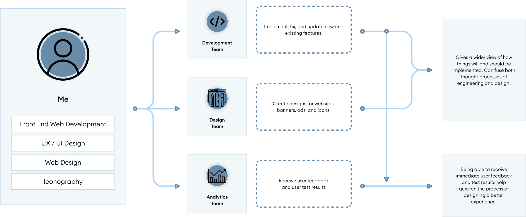
My role was both a UX/UI Designer and Front End Web Developer; I was part of both the development and design team. I also worked in close contact with the analytics team to get user-based information.
Users
Rugs USA caters to customers who want a great quality rug without having to break their wallets. It is crucial to keep in mind that there are both completely new buyers and experienced buyers.
Issue: Cart Abandonment
A huge issue that was brought to attention by the analytics team were the amount of carts abandoned. Customers would leave the website or cancel purchases because of many uncertain components - how a rug would look, fit, or difficulty keeping clean.
My main goal was to provide answers to all user-based questions to increase confident purchases and decrease cart abandonment.
I decided to create an all-in-one guide for all questions that customers may have. I started my own solo project, Rugs 101 - a buyer's guide for all customers who need guidance when purchasing a rug.
Order of Goals
In addition to Rugs 101, I decided to revamp the initial shopping experience. A user needs to feel confident from start to finish.
I noted the issues with the current shopping experience and laid out the areas that needed adjustments.
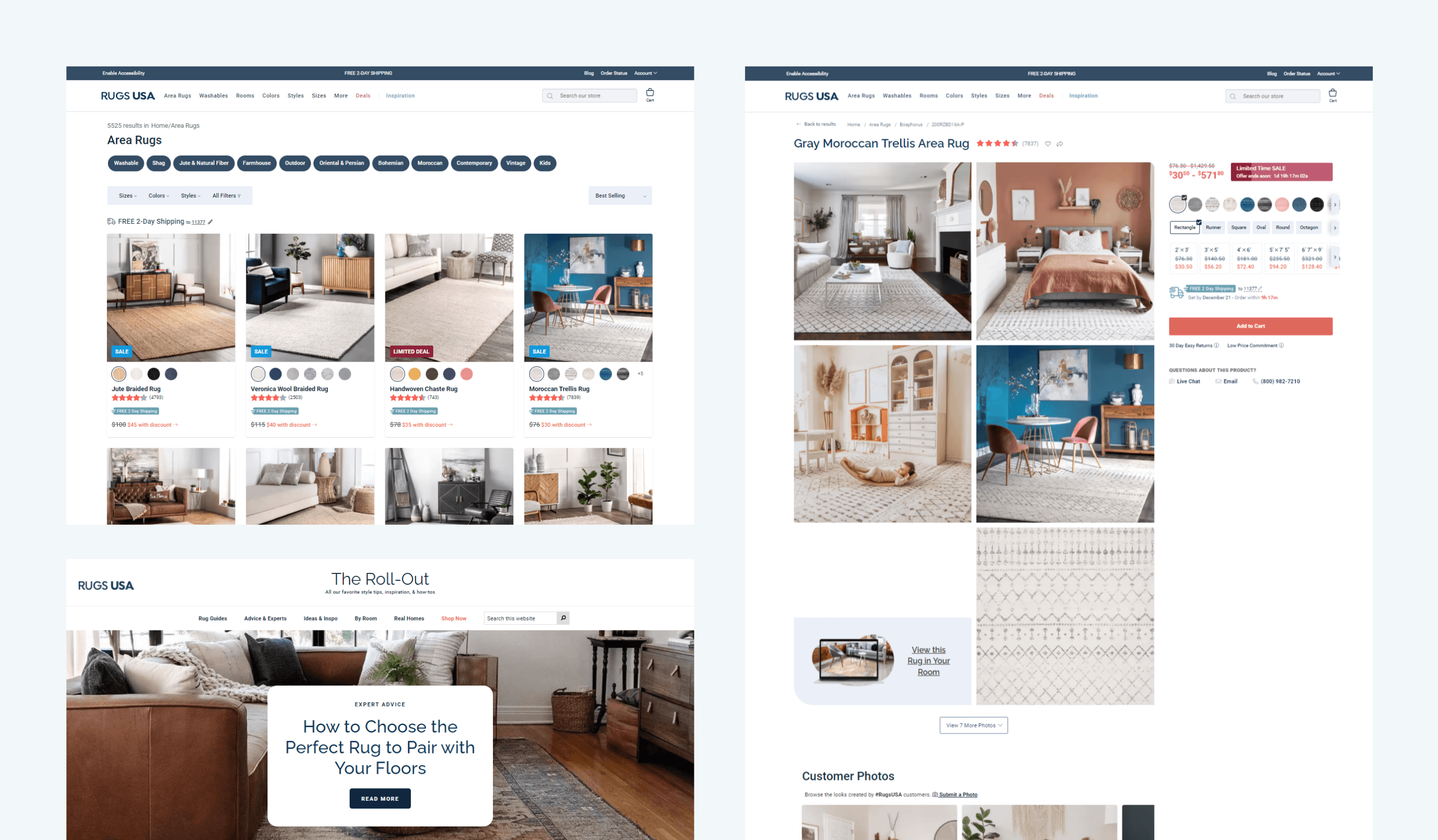
Rugs Catalog - Users are presented with a catalog of rugs and preview cards. Filters can be used to narrow down the search.
Rug Full View - After a user selects a rug from the catalog, they are sent to the rug full view information page. Detailed information regarding the rug can be seen here.
Rugs 101 (New) - To tackle all cart abandonment possibilities, Rugs 101 presents an all-in-one glossary for all purchase questions/concerns to provide confidence to every buyer.
Window Shopping
Rugs USA's catalog page features a wide preview of rugs with a filter system to narrow down searches. Each rug has its own subset of information, giving general ideas of variations and properties.
What's the issue?
After consulting with the analytics team, we concluded there were two main issues:
The first issue was the obscene amount of filters with no structure. There isn't a huge issue with a massive selection of filters, but it becomes a hindrance when there is no structure to them.
The second issue was the lack of useful information within each rug preview card. Crucial information was missing and users were annoyed at having to click on a product to view said information.

Rugs Catalog Pt.1 - Filter
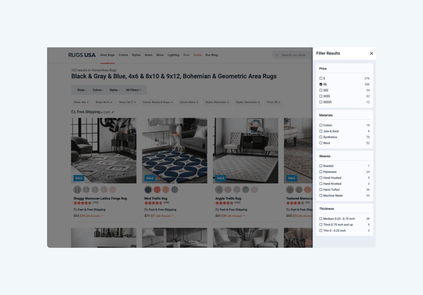
After identifying the lack of structure, I categorized each option based on relatability. This created an organized overview for users to find what they're looking for with ease.
Since the rug preview cards were the main content, I moved the most popular filters to the top. This provided a wider range of viewable cards per row - reducing the amount of scrolling.
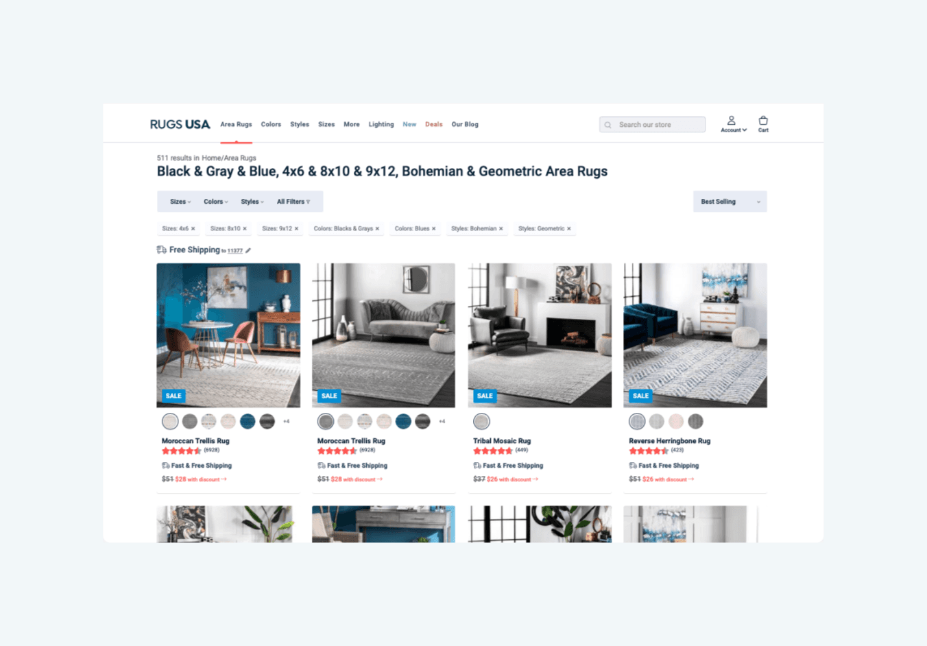
The rest of the filters could be found with a button, revealing all possible filters.
Rugs Catalog Pt.2 - Cards
Initially, the rug preview cards showed 3 pieces of information - color variations, rug name, and sale banner. In the age of online shopping, this was nowhere near enough information.
After reviewing what customers requests and viewing successful shopping experiences, I decided on adding 3 crucial pieces of information:
Ratings and number of reviews are essential in a preview because it provides a quick view of what other customers experienced with the product.
Showing the sales price provides a transparent view of the price customers will receive without the possibility of disappointment when they view a product.
In a society where fast shipment can make or break sales, showing how fast a product is shipped gives customers more incentives to purchase a product.

Found an eye-catching rug?
When a customer views a rug, they are presented with the rug full view page. This is where the specificities of each rug is presented.
What's the issue?
The issue of the initial rug full view page was it provided similar information to the rug preview cards; it was too general and didn't show specificity.
Another issue was the lack of useful features to keep customers engaged. There was no personalized information or interactive and engaging features.
What I Did
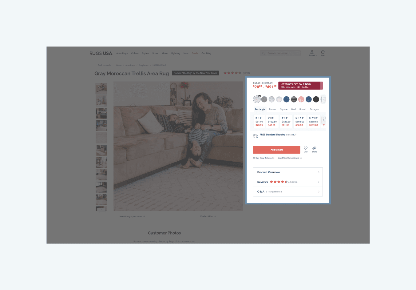
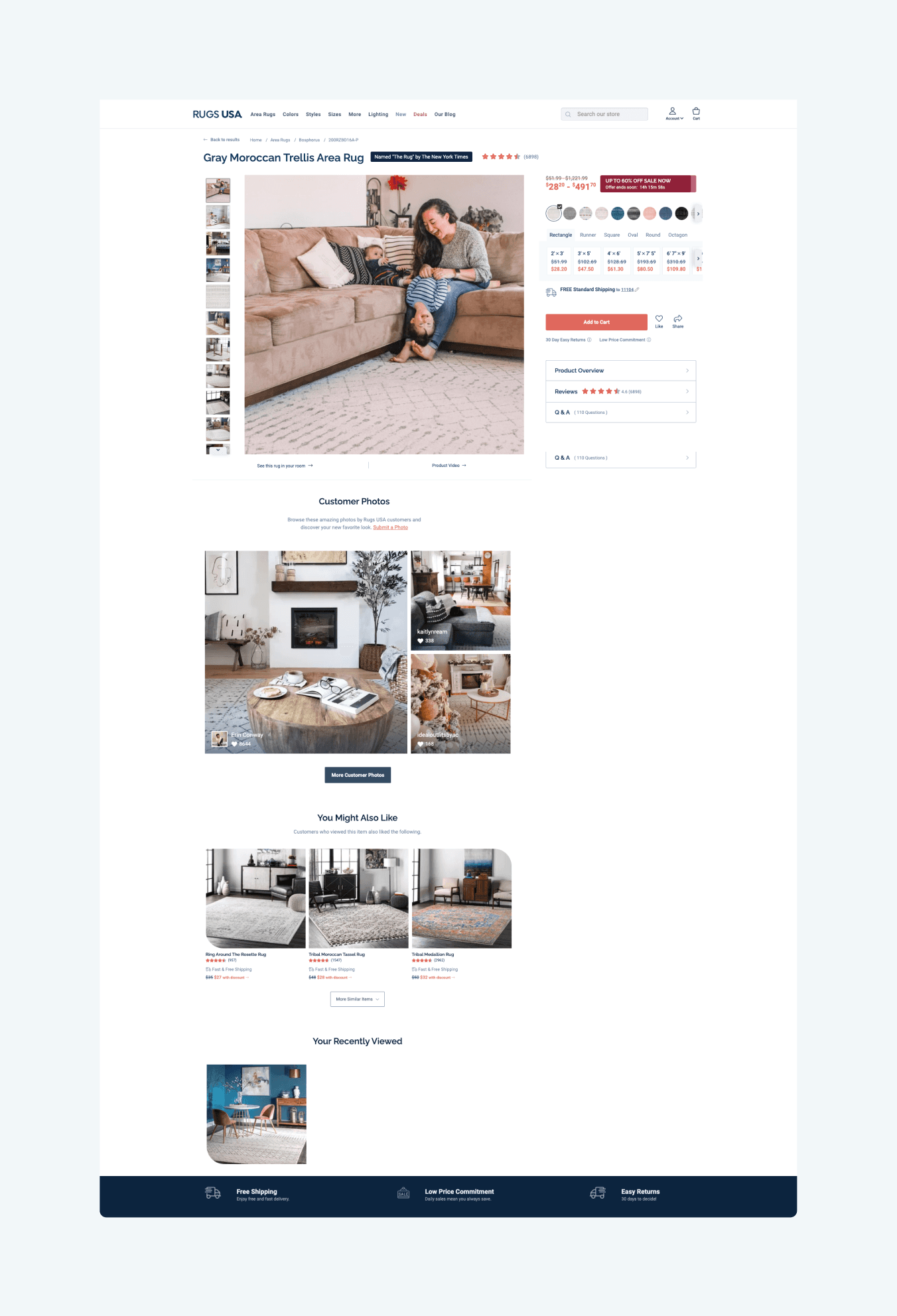
The first issue I tackled was the lack of specified information. For the main content, I included a sale timer, every color of the rug, each shape that the rug comes in, every sizing, prices and sales prices for all variations, and shipment estimation.
For the lack of interaction and personalized shopping experience, I provided a "You might also like" and "Your recently viewed" to provide a quick way to access recommendations and previously interested items.
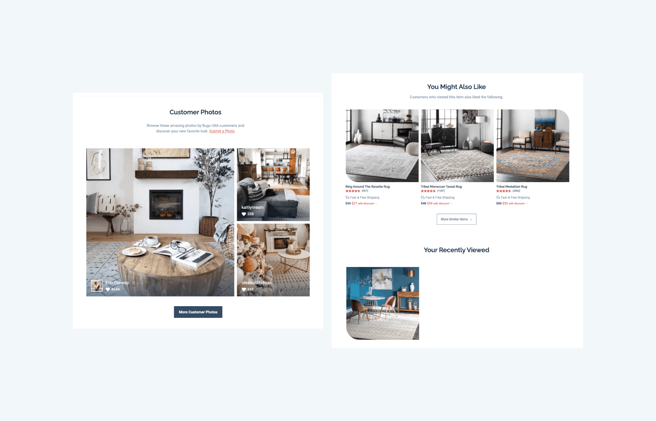
Since reviews and other customer experiences are so crucial when purchasing products, I included a section to view full customer reviews, questions and answers, and customer-uploaded photos. This gave customers third-party feedback about the potential product while also providing inspiration and ideas.
Final Result
The Ultimate All-in-One
This is where I began to really tackle the main issue of cart abandonment. I began the project Rugs 101 to clear any final uncertainties.
What is Rugs 101?
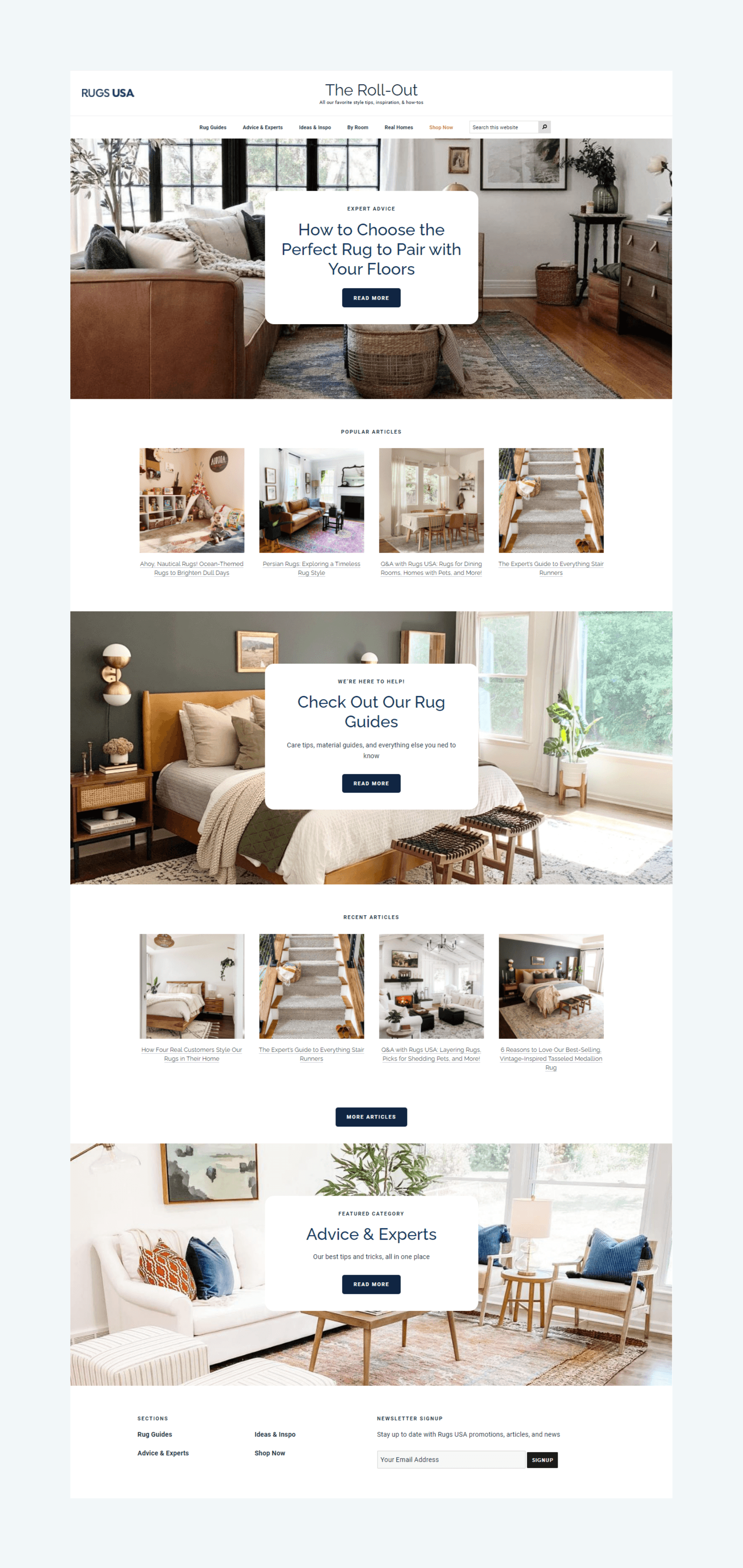
Rugs 101 is an all-in-one buyer's guide for customers who have questions or are unsure about their purchase. Rugs 101 features information regarding:
Rug Sizing
Weaves and Materials
Washing Instructions
How it will fit their room (Dimensions)

These were the main questions and concerns users have given through feedback. Also included is a glossary for terms that customers may not be familiar with. This broadens the customer's knowledge for future rug purchases.
Final Result
Each section goes over in full detail of their respective topics, including images that visualize each topic. I made sure to keep it scalable for future content.
Conclusion
Knowing the needs of the customer is a huge part of confident purchases. It's stressful for customers when they have to decide on an uncertain product. Providing as much detail from different information blocks can dissolve some of that uncertainty.
After reviewing analytics, we received a lot of activity and views on our Rugs 101 guide in conjunction with rug purchases - decreasing overall cart abandonment by 24%. This shows that even a bit of guidance can generate confidence in any customer.
Rugs USA
Timeline
2018 - 2019
My Role
Front End Web Developer & Designer

What is Rugs USA?
Rugs USA is an ecommerce shop primarily focused on selling high quality rugs at the best prices. Rugs USA provides a wide range of sizes, designs, and weaves made for any customer.
Roles
My role was both a UX/UI Designer and Front End Web Developer; I was part of both the development and design team. I also worked in close contact with the analytics team to get user-based information.

Users
Rugs USA caters to customers who want a great quality rug without having to break their wallets. It is crucial to keep in mind that there are both completely new buyers and experienced buyers.
Issue: Cart Abandonment
A huge issue that was brought to attention by the analytics team were the amount of carts abandoned. Customers would leave the website or cancel purchases because of many uncertain components - how a rug would look, fit, or difficulty keeping clean.
My main goal was to provide answers to all user-based questions to increase confident purchases and decrease cart abandonment.
I decided to create an all-in-one guide for all questions that customers may have. I started my own solo project, Rugs 101 - a buyer's guide for all customers who need guidance when purchasing a rug.
Order of Goals
In addition to Rugs 101, I decided to revamp the initial shopping experience. A user needs to feel confident from start to finish.
I noted the issues with the current shopping experience and laid out the areas that needed adjustments.
Rugs Catalog - Users are presented with a catalog of rugs and preview cards. Filters can be used to narrow down the search.
Rug Full View - After a user selects a rug from the catalog, they are sent to the rug full view information page. Detailed information regarding the rug can be seen here.
Rugs 101 (New) - To tackle all cart abandonment possibilities, Rugs 101 presents an all-in-one glossary for all purchase questions/concerns to provide confidence to every buyer.

Window Shopping
Rugs USA's catalog page features a wide preview of rugs with a filter system to narrow down searches. Each rug has its own subset of information, giving general ideas of variations and properties.
What's the issue?
After consulting with the analytics team, we concluded there were two main issues:
The first issue was the obscene amount of filters with no structure. There isn't a huge issue with a massive selection of filters, but it becomes a hindrance when there is no structure to them.
The second issue was the lack of useful information within each rug preview card. Crucial information was missing and users were annoyed at having to click on a product to view said information.

Rugs Catalog Pt.1 - Filter
After identifying the lack of structure, I categorized each option based on relatability. This created an organized overview for users to find what they're looking for with ease.
Since the rug preview cards were the main content, I moved the most popular filters to the top. This provided a wider range of viewable cards per row - reducing the amount of scrolling.

The rest of the filters could be found with a button, revealing all possible filters.

Rugs Catalog Pt.2 - Cards
Initially, the rug preview cards showed 3 pieces of information - color variations, rug name, and sale banner. In the age of online shopping, this was nowhere near enough information.
After reviewing what customers requests and viewing successful shopping experiences, I decided on adding 3 crucial pieces of information:
Ratings and number of reviews are essential in a preview because it provides a quick view of what other customers experienced with the product.
Showing the sales price provides a transparent view of the price customers will receive without the possibility of disappointment when they view a product.
In a society where fast shipment can make or break sales, showing how fast a product is shipped gives customers more incentives to purchase a product.

Found an eye-catching rug?
When a customer views a rug, they are presented with the rug full view page. This is where the specificities of each rug is presented.
What's the issue?
The issue of the initial rug full view page was it provided similar information to the rug preview cards; it was too general and didn't show specificity.
Another issue was the lack of useful features to keep customers engaged. There was no personalized information or interactive and engaging features.
What I Did
The first issue I tackled was the lack of specified information. For the main content, I included a sale timer, every color of the rug, each shape that the rug comes in, every sizing, prices and sales prices for all variations, and shipment estimation.

For the lack of interaction and personalized shopping experience, I provided a "You might also like" and "Your recently viewed" to provide a quick way to access recommendations and previously interested items.

Since reviews and other customer experiences are so crucial when purchasing products, I included a section to view full customer reviews, questions and answers, and customer-uploaded photos. This gave customers third-party feedback about the potential product while also providing inspiration and ideas.
Final Result

The Ultimate All-in-One
This is where I began to really tackle the main issue of cart abandonment. I began the project Rugs 101 to clear any final uncertainties.
What is Rugs 101?
Rugs 101 is an all-in-one buyer's guide for customers who have questions or are unsure about their purchase. Rugs 101 features information regarding:
Rug Sizing
Weaves and Materials
Washing Instructions
How it will fit their room (Dimensions)

These were the main questions and concerns users have given through feedback. Also included is a glossary for terms that customers may not be familiar with. This broadens the customer's knowledge for future rug purchases.
Final Result
Each section goes over in full detail of their respective topics, including images that visualize each topic. I made sure to keep it scalable for future content.

Conclusion
Knowing the needs of the customer is a huge part of confident purchases. It's stressful for customers when they have to decide on an uncertain product. Providing as much detail from different information blocks can dissolve some of that uncertainty.
After reviewing analytics, we received a lot of activity and views on our Rugs 101 guide in conjunction with rug purchases - decreasing overall cart abandonment by 24%. This shows that even a bit of guidance can generate confidence in any customer.
Rugs USA
Timeline
2018 - 2019
My Role
Front End Web Developer & Designer

What is Rugs USA?
Rugs USA is an ecommerce shop primarily focused on selling high quality rugs at the best prices. Rugs USA provides a wide range of sizes, designs, and weaves made for any customer.
Roles
My role was both a UX/UI Designer and Front End Web Developer; I was part of both the development and design team. I also worked in close contact with the analytics team to get user-based information.

Users
Rugs USA caters to customers who want a great quality rug without having to break their wallets. It is crucial to keep in mind that there are both completely new buyers and experienced buyers.
Issue: Cart Abandonment
A huge issue that was brought to attention by the analytics team were the amount of carts abandoned. Customers would leave the website or cancel purchases because of many uncertain components - how a rug would look, fit, or difficulty keeping clean.
My main goal was to provide answers to all user-based questions to increase confident purchases and decrease cart abandonment.
I decided to create an all-in-one guide for all questions that customers may have. I started my own solo project, Rugs 101 - a buyer's guide for all customers who need guidance when purchasing a rug.
Order of Goals
In addition to Rugs 101, I decided to revamp the initial shopping experience. A user needs to feel confident from start to finish.
I noted the issues with the current shopping experience and laid out the areas that needed adjustments.
Rugs Catalog - Users are presented with a catalog of rugs and preview cards. Filters can be used to narrow down the search.
Rug Full View - After a user selects a rug from the catalog, they are sent to the rug full view information page. Detailed information regarding the rug can be seen here.
Rugs 101 (New) - To tackle all cart abandonment possibilities, Rugs 101 presents an all-in-one glossary for all purchase questions/concerns to provide confidence to every buyer.

Window Shopping
Rugs USA's catalog page features a wide preview of rugs with a filter system to narrow down searches. Each rug has its own subset of information, giving general ideas of variations and properties.
What's the issue?
After consulting with the analytics team, we concluded there were two main issues:
The first issue was the obscene amount of filters with no structure. There isn't a huge issue with a massive selection of filters, but it becomes a hindrance when there is no structure to them.
The second issue was the lack of useful information within each rug preview card. Crucial information was missing and users were annoyed at having to click on a product to view said information.

Rugs Catalog Pt.1 - Filter
After identifying the lack of structure, I categorized each option based on relatability. This created an organized overview for users to find what they're looking for with ease.
Since the rug preview cards were the main content, I moved the most popular filters to the top. This provided a wider range of viewable cards per row - reducing the amount of scrolling.

The rest of the filters could be found with a button, revealing all possible filters.

Rugs Catalog Pt.2 - Cards
Initially, the rug preview cards showed 3 pieces of information - color variations, rug name, and sale banner. In the age of online shopping, this was nowhere near enough information.
After reviewing what customers requests and viewing successful shopping experiences, I decided on adding 3 crucial pieces of information:
Ratings and number of reviews are essential in a preview because it provides a quick view of what other customers experienced with the product.
Showing the sales price provides a transparent view of the price customers will receive without the possibility of disappointment when they view a product.
In a society where fast shipment can make or break sales, showing how fast a product is shipped gives customers more incentives to purchase a product.

Found an eye-catching rug?
When a customer views a rug, they are presented with the rug full view page. This is where the specificities of each rug is presented.
What's the issue?
The issue of the initial rug full view page was it provided similar information to the rug preview cards; it was too general and didn't show specificity.
Another issue was the lack of useful features to keep customers engaged. There was no personalized information or interactive and engaging features.
What I Did
The first issue I tackled was the lack of specified information. For the main content, I included a sale timer, every color of the rug, each shape that the rug comes in, every sizing, prices and sales prices for all variations, and shipment estimation.

For the lack of interaction and personalized shopping experience, I provided a "You might also like" and "Your recently viewed" to provide a quick way to access recommendations and previously interested items.

Since reviews and other customer experiences are so crucial when purchasing products, I included a section to view full customer reviews, questions and answers, and customer-uploaded photos. This gave customers third-party feedback about the potential product while also providing inspiration and ideas.
Final Result

The Ultimate All-in-One
This is where I began to really tackle the main issue of cart abandonment. I began the project Rugs 101 to clear any final uncertainties.
What is Rugs 101?
Rugs 101 is an all-in-one buyer's guide for customers who have questions or are unsure about their purchase. Rugs 101 features information regarding:
Rug Sizing
Weaves and Materials
Washing Instructions
How it will fit their room (Dimensions)

These were the main questions and concerns users have given through feedback. Also included is a glossary for terms that customers may not be familiar with. This broadens the customer's knowledge for future rug purchases.
Final Result
Each section goes over in full detail of their respective topics, including images that visualize each topic. I made sure to keep it scalable for future content.

Conclusion
Knowing the needs of the customer is a huge part of confident purchases. It's stressful for customers when they have to decide on an uncertain product. Providing as much detail from different information blocks can dissolve some of that uncertainty.
After reviewing analytics, we received a lot of activity and views on our Rugs 101 guide in conjunction with rug purchases - decreasing overall cart abandonment by 24%. This shows that even a bit of guidance can generate confidence in any customer.
